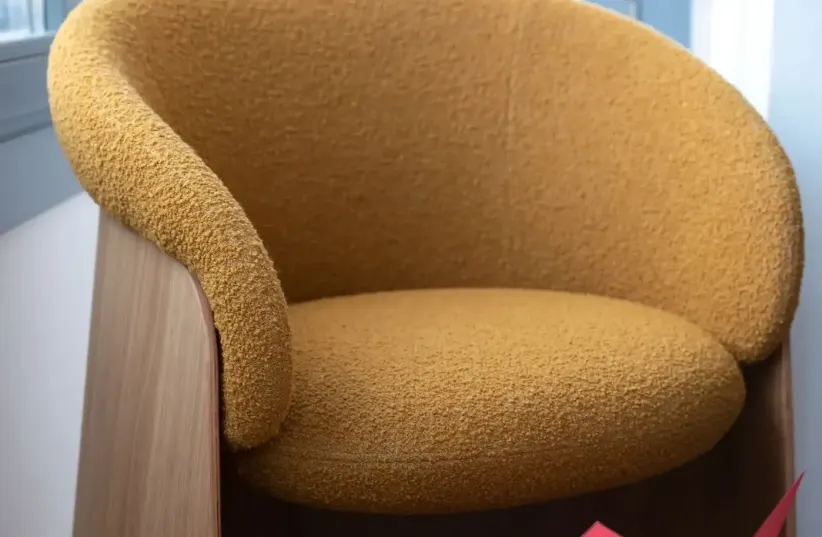
The design trends for the coming year reveal a lot of use of monochromatic and intense colors. Design exhibitions throughout Europe present their news and it is clear that the use of color enters home design more than ever, as well as the worlds of fashion. Deep and beautiful Biscay blue, and Brique in shades of red wine, purple and green, are just some of the colors you'll see in armchairs and even serving dishes in your home. The idea is to know how to create combinations, says Carmit Redlich, owner of the quality brand "prat living": touches of color in the carpets, a combination of armchairs in Biscay blue, a color that, as mentioned, is going to be strong and prominent this year, alongside purples. brique color in wine tone and more. Games of red and blue that stretch the boundaries. The idea is to combine the color in the small items, in the details.
")
")
The design brand Baci milano, which has now arrived in Israel, brings with it a refreshing and captivating breath of colorful homeware and design items. Among them is the LE ROUGE collection characterized by the color red which brings warmth of passion and refinement, becoming the common thread between tradition and contemporaneity in perfect balance, as well as the VERSAILLES living collection in the shade of blue, a charm of elegance full of joy and romance.
")
")
")
")
Carmit Redlich, owner of prat living stores, importers of quality brands from around Europe, explains: "The collections for 2024 are diverse and combine, on the one hand, typical Danish restraint, classic, and elegant, and on the other hand, a recent and contemporary version in subdued monochromatic colors as well as slightly less subdued colors coming from Spain, Finland, and Eastern Europe.
")
")
")
This year, too, the Danish design houses are focusing on returning and gratitude to nature, in which the colors move around shades of sand and earth - usually soft, caressing, warm (appropriate for the cold half of the year) through smoky ocean tones - deep encounters between blue and green and through a wide range of Green as a tribute to the vegetation that surrounds us, which is getting more and more space in the design of the space in recent years. In the sector of the Spanish, German, as well as the Finnish and Norwegian design houses, a certain turn is expected this year in terms of colors. Alongside the extensive use of wood, with neutral textile shades on the beige-gray scale, we are witnessing a burst of color that we haven't experienced so much in recent seasons.
")
")
")
Here, too, shows of blue-green on its shades, but also a development or stretch of worsening worlds - to real reds, yellows - which are a consequence and update of the "brass" we saw in the previous years, and even soft and optimistic lavender shades. In a complete scene, in the worlds of design to which we belong, these shades will usually appear as a spot shot of color and around them they will be complemented by furniture, accessories and lighting items and textiles in neutral shades and the natural coloring that comes from the material - wood in all its types and shades, metals in raw natural or oxidized shades, transparent and smoked glasses and the range of colors The specialty of natural stones (marble).