Professor Abraham Wyner showed that the Hamas-controlled Gaza Health Ministry has been "faking" casualty numbers, in an article for Tablet Magazine on March 7.
A professor of Statistics and Data Science at the University of Pennsylvania's Wharton School, Wyner provided a detailed analysis of the data from the Gaza Health Ministry, which showed that they had, at the very minimum, been doctored – and at worst, completely faked.
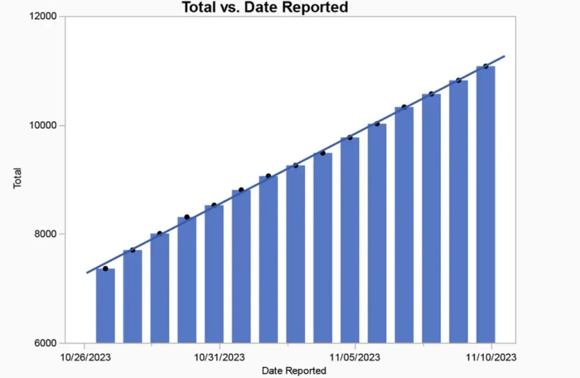
Wyner first tackles the total reported deaths, which he shows climbed by 270 plus or minus about 15% every day. This, he says, is statistically impossible: "There should be days with twice the average or more and others with half or less."

"The graph of total deaths by date is increasing with almost metronomical linearity," he says – meaning at a regular rate, like a metronome.
Double-checking the data with independent verification will be impossible due to the lack of independent sources in Gaza.
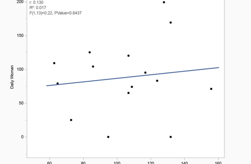
He then says we should see the variation in the number of child deaths that tracks with the variation in women's deaths.

Due to the nature of war, we should see variations in the daily totals of children's and women's deaths, but the overall percentage should stay relatively stable.
"Consequently, on the days with many women casualties, there should be large numbers of children casualties, and on the days when just a few women are reported to have been killed, just a few children should be reported."
A total lack of correlation
However, the data showed an almost total lack of correlation, which Wyner said should be a major signal that the numbers have been faked.
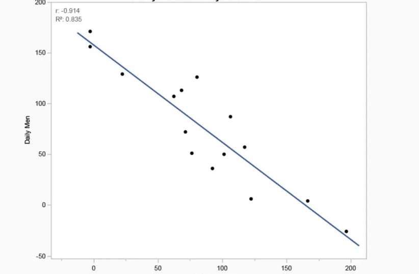
His next piece of evidence is that there should be a strong positive correlation between the deaths of women and men; however, what he found was the opposite. The correlation instead showed a strong negative correlation between men and women, which he says is the third major piece of evidence that the data has been faked.
"If these were just reporting errors, then on those days where the death count for men appears to be in error, the women’s count should be typical, at least on average. But it turns out that on the three days when the men’s count is near zero, suggesting an error, the women’s count is high. In fact, the three highest daily women casualty counts occurs on those three days."

"While the evidence is not dispositive, it is highly suggestive that a process unconnected or loosely connected to reality was used to report the numbers," he says.
"Most likely, the Hamas ministry settled on a daily total arbitrarily," he concludes. "We know this because the daily totals increase too consistently to be real. Then they assigned about 70% of the total to be women and children, splitting that amount randomly from day to day. Then they in-filled the number of men as set by the predetermined total. This explains all the data observed."
He also highlights that by Hamas's own admission, 6,000 Hamas fighters have been killed, which if combined with Hamas's data on deaths, shows that 20% of the total deaths are combatant while 70% are women and children. This implies that "Israel is somehow not killing noncombatant men, or else Hamas is claiming that almost all the men in Gaza are Hamas fighters."
In conclusion, he says, "The truth can’t yet be known and probably never will be. The total civilian casualty count is likely to be extremely overstated."
Article criticized for use of limited sample, graph called misleading
The article has not been received with unanimous approval, however. In a post to his blog, 'Bits of DNA,' the computational biologist Lior Pachter, himself Israeli, criticized Wyner's article.
The scientist suggesting that Wyner's use of cumulative sums in his graph- in other words, showing all deaths reported thus far rather than only the number of deaths reported on each given day- created a misleading impression of regularity.
The slope appears consistent in Wyner's graphs, Pachter argued, but the slope of almost any cumulative graph would look that way at first glance, because the numbers can only go up.
In addition, the daily increase is so small relative to the total sum that readers will have trouble distinguishing the difference between the different day-to-day increases. On a graph whose bottom limit was the sum total on the first day, rather than 0, those differences would be easier to identify.
Readers would expect a 'true' graph of casualties to appear erratic, with the line moving up and down, and this is in fact what the daily reported casualty counts look like when plotted on a graph without the cumulative sums.
Wyner was also criticized for using only a 15 day sample of the war, rather than a larger timeframe.
